Get In Touch
kaigezhengzz@gmail.com

Seamless Sign-in & 2FA Enrollment

My Contribution 

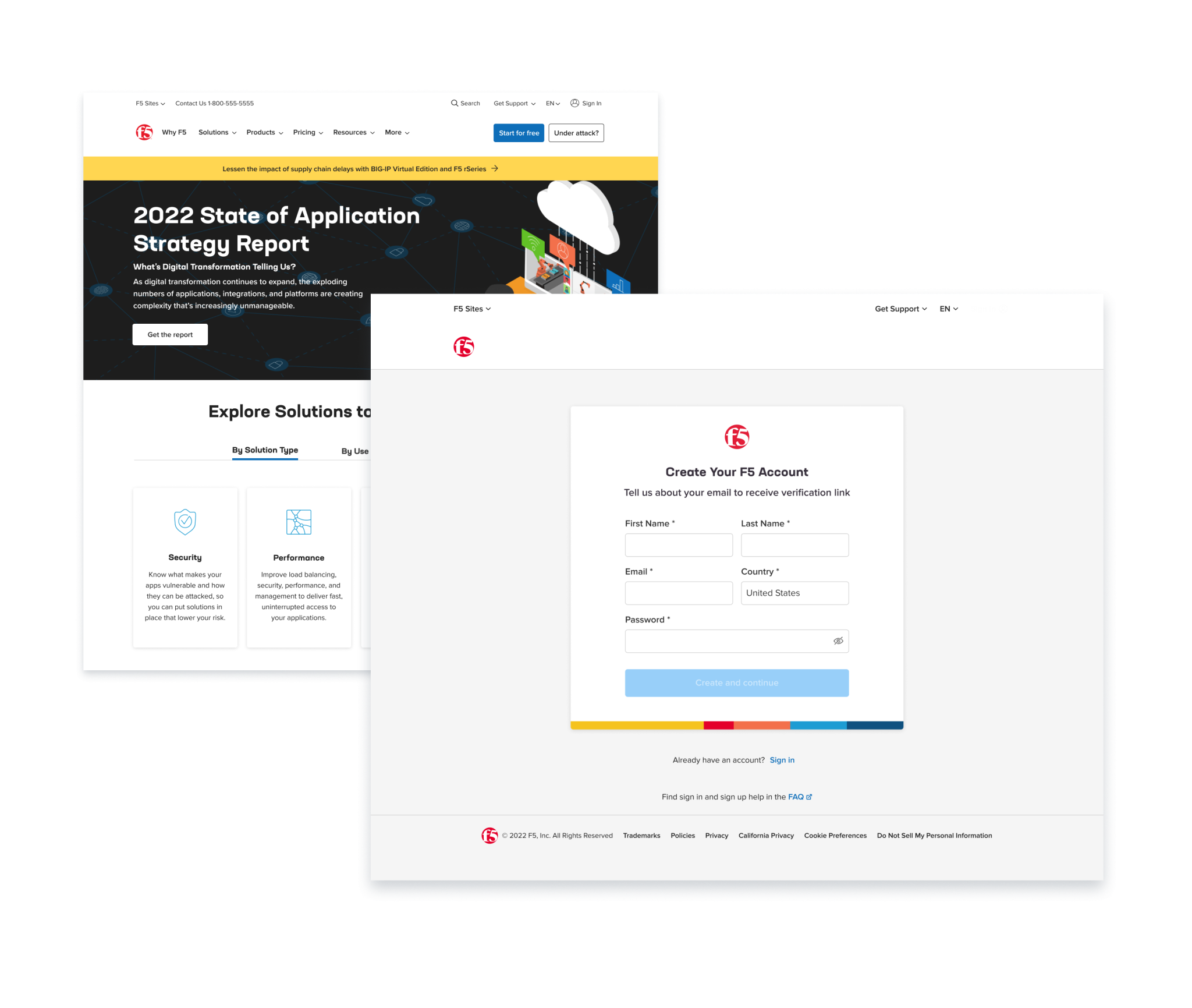
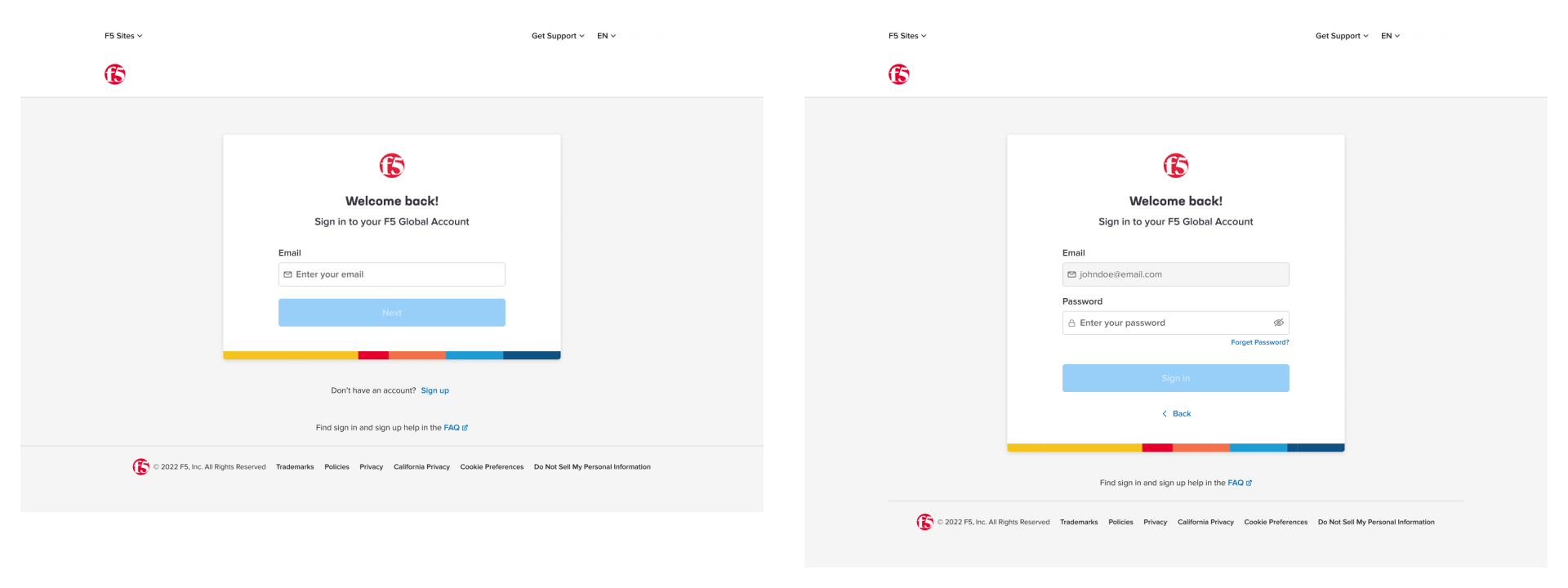
I led the stakeholder meeting, concept creation, and high-fidelity mockups for the development. This is also the first project with the use of a new design system that I have developed. The scope of this work includes sign-in, sign-up, 2FA enrollment, Error handling, and responsiveness.

Task

Creating a seamless sign-in experience so that users would have a consistent perception towards website experience.

  • Design

    UI/UX Design, Branding

  • Role

    UX Designer

  • Time

    Dec 2022 - Feb 2023

  • Team Credit

    Molly R. - UX Designer

Seamless Sign-in

Problem 

When users move through an F5 ecosystem that contains a variety of UI styles, users are less sure where they are, and where they are going.

For The Business 

This causes issues such as lower rates of sign-up and sign-in, and higher abandonment rates during such task flows.

For Users

This problem contributes to lower user satisfaction and confidence.

UX Requirements​ for Sign-in

Users have a Consistent Sign-in Experience by 

  1. ensuring they have the same UX flow and entry points
  2. having visual styles that match the rest of the sites
  3. having the same information like copy and the order of the items

Business Needs to Build Brand Identity by 

  1. Introducing F5 Logo on the same location 
  2. Introducing a Color bar that can represent the identity of different sites 

Web Product is Accessible by 

  1. being information-focused with card design and legible for sighted users 
  2. being usable across all devices changes 
  3. being coded to support keyboard and screenreader accessibility 

2FA Enrollment after Sign-in

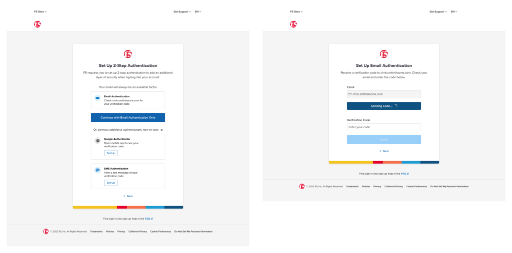
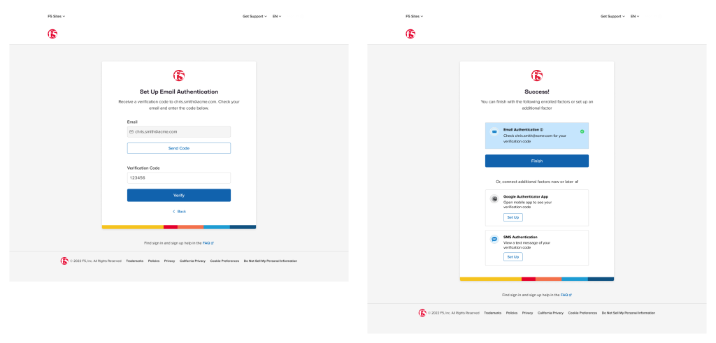
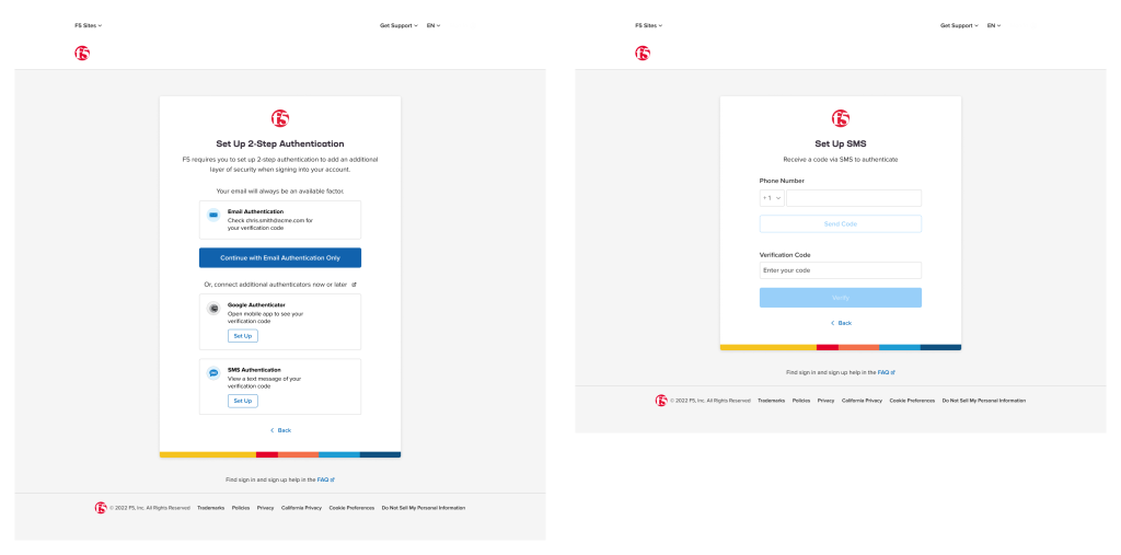
As a security company, for both business and security considerations, F5 wants to introduce 2FA (2-factor authentication) to both existing users and new users. I led the design for creating UX flow for different enrollment cases, and edge cases with the new design system. 

Use case: Enroll with Email

As a business requirement, email factor is a must-enroll for users. One of the challenges for me was to to deliver the message that they have to enroll email factor but at the same time not let them feel compelled (even though it was ). Among different design options, stakeholder and I decided to go with card layout to let users focus on the most important task on the screen while downplaying the navigational elements. 

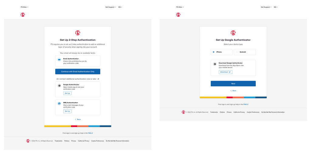
Use case: Enroll with SMS

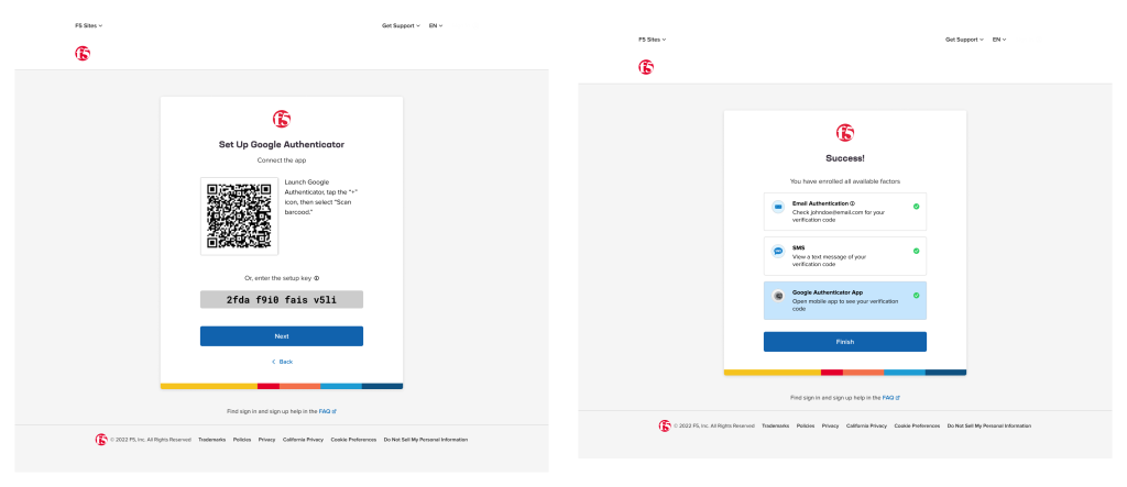
Use case: Enroll with GA After SMS​

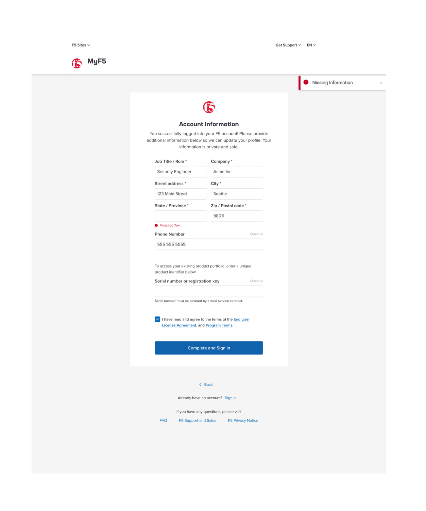
Error Handling

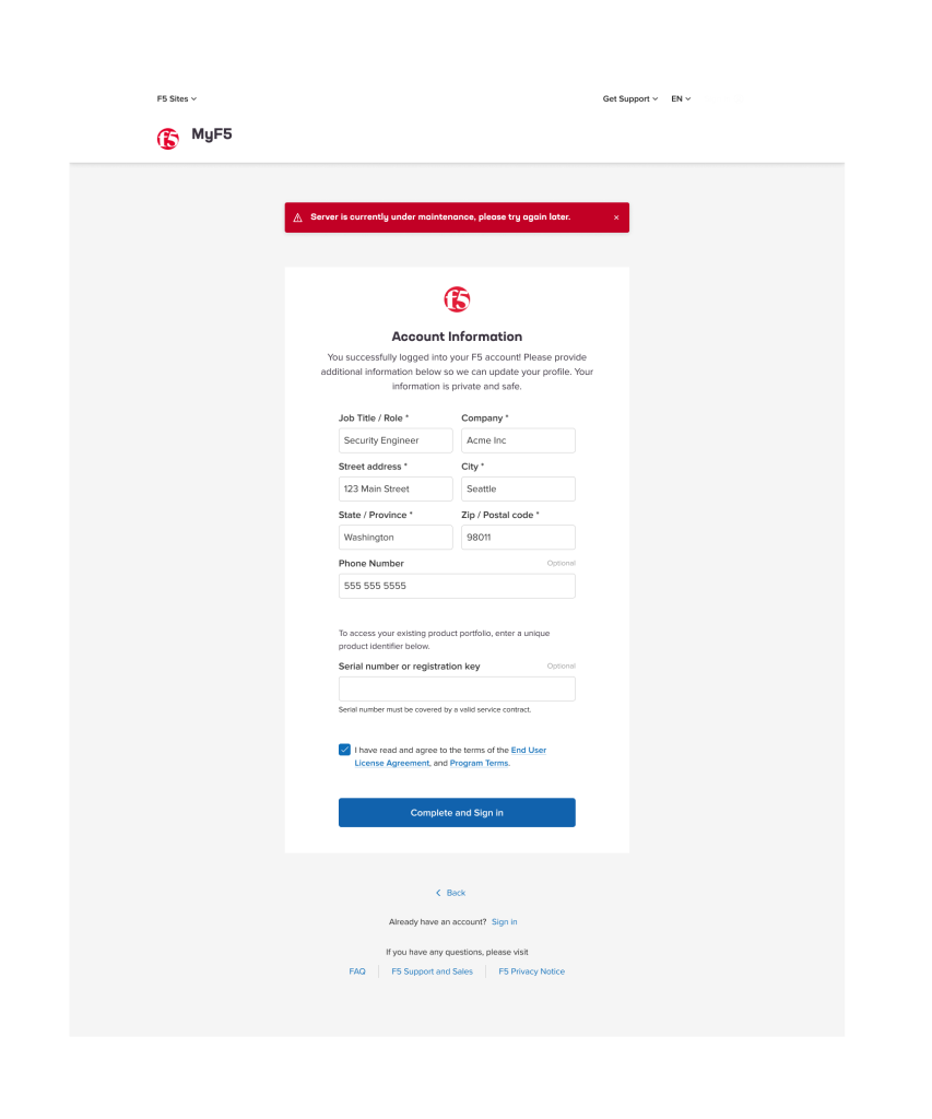
Section Error
Server Side Error

Responsiveness