UX Design/Research for Monterey Bay Aquarium
Monterey Bay Aquarium wanted to evaluate its website’s usability and get a fresh eye on what they could improve to adapt to the pandemic. This project delivered the research insights with emphasis on navigation, live cam pages, and donation experience.
-
Design
UX Research, Usability Testing, Web Analytics
-
Client
Monterey Bay Aquarium (Design team)
-
Type
Team Project
-
Responsibility
Lead UX Researcher
About Client
Monterey Bay Aquarium is the largest nonprofit public aquarium located in California.
Goal
Monterey Bay Aquarium wanted to evaluate its website’s usability and get a fresh eye on what they could improve to adapt the pandemic.
My Role
I designed the research plan, tree testing, and usability testing and participated in the UI recommendations.
Project Summary
What is the status quo?
The clients come with the following problems
Content is too deep
"Our mega nav and our visibility does not represent our back end. There is much more than we can see."
How people interact
"New site and we don’t know how people will interact with it in a regular time."
Convert members without visiting
"We don’t have a developed vision on how to make people members without visiting. We want the members to believe in what we do. "
How does the website help users
Planning before visit
Review after visit
Teaching Resources
Key insights from Web Analytics

Live Cams pages are the engaging websites ones with 32.2% higher bounce rate and 23.5% lower exit rate than the average pages.
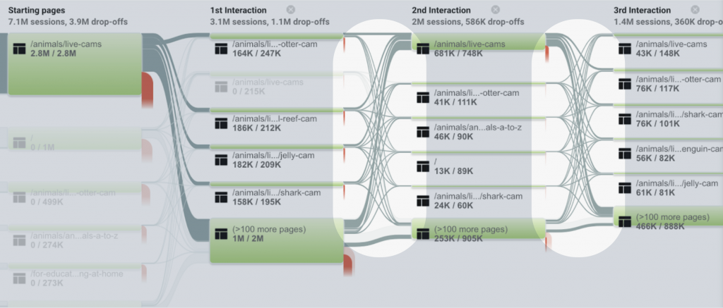
By analyzing the user flow, we found that people tend to switch between live cam pages other than to explore deeper content.
From the client and the analytics
- – Make deeper content more discoverable through effective navigation.
- – Improve ease of use and maximize user engagement with the content on Live Cam Pages.
- – Increase support opportunities from users through improving engagement with Animal Pages.
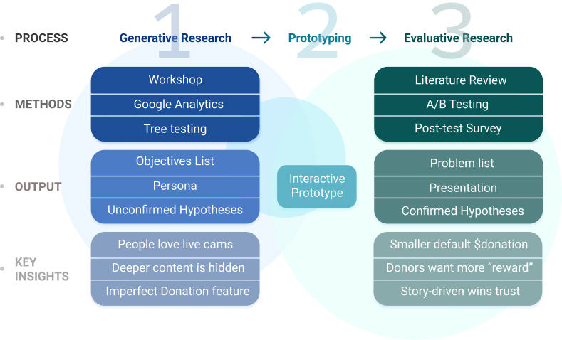
Our final goal is to deliver the provable research insights with the design solution.
Generative research
Prototyping
.
Evaluative research
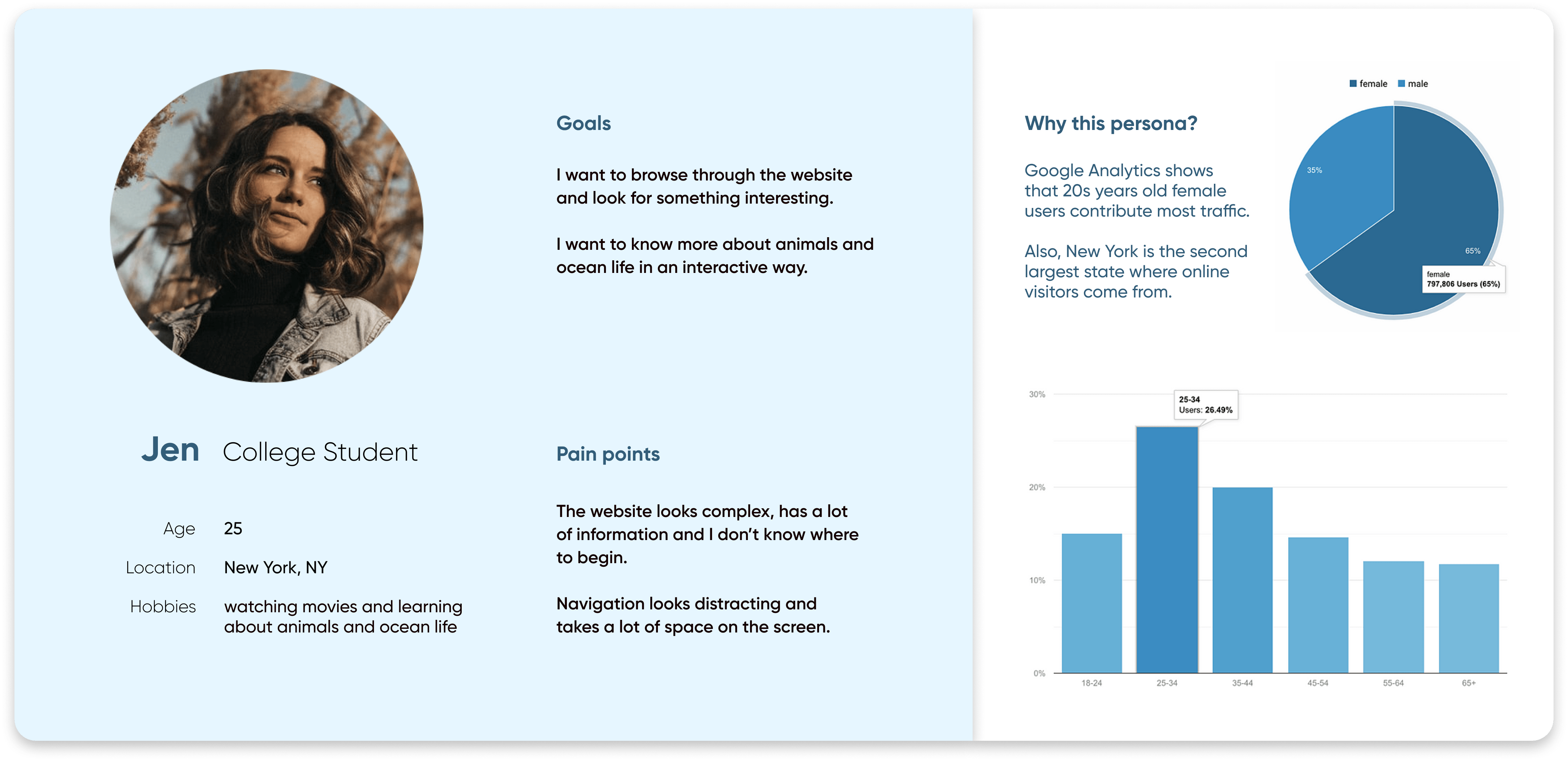
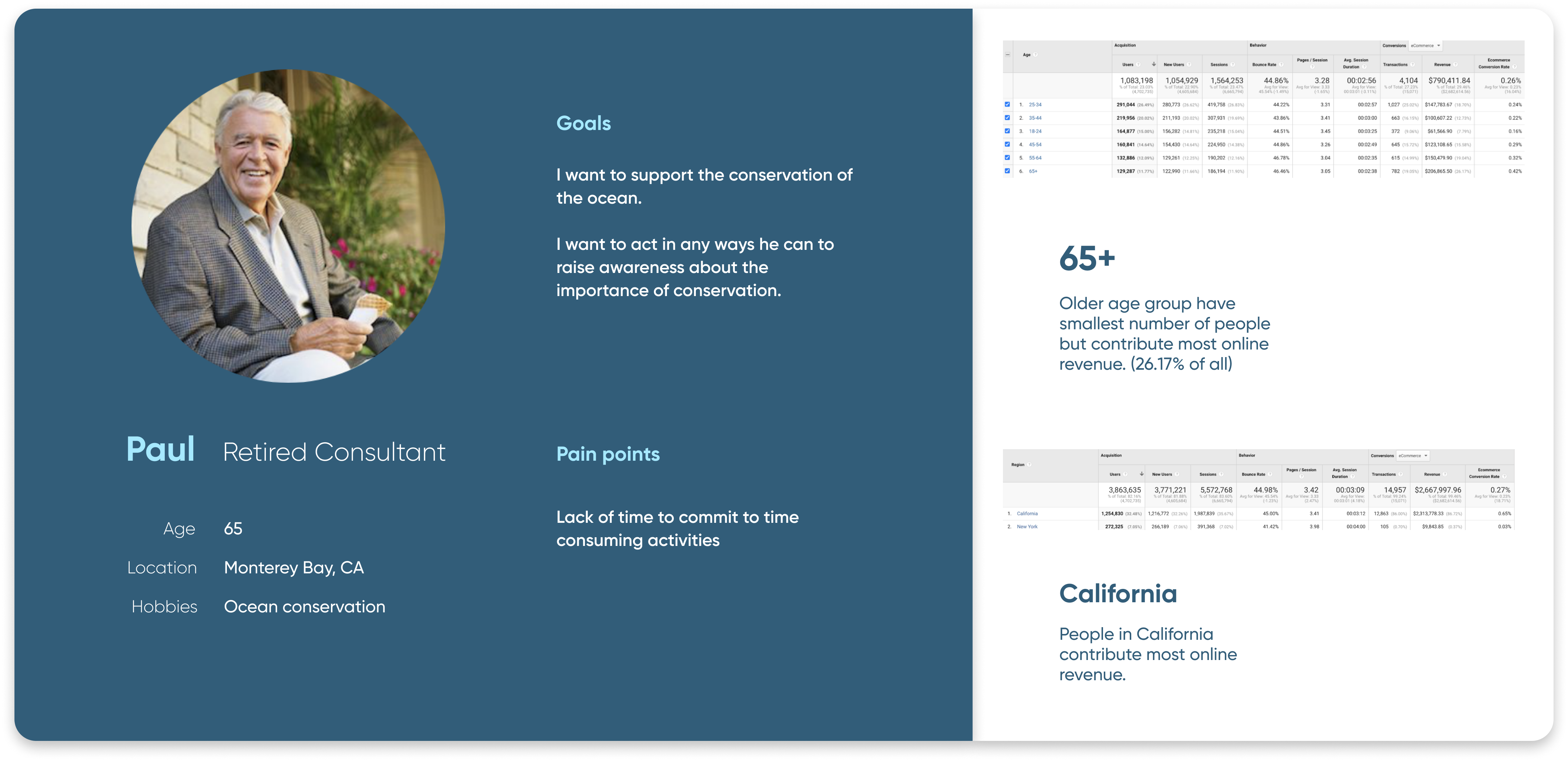
Who are the audience groups and the traits?
"Digital Visitors" and "Donors"
We found out two different groups of the audience who bring the website the most traffic and most revenue. *Online visitors do not necessarily have been to the aquarium.
How well does the original navigation work for "Online Visitors"to access deeper content and live cams?
Find out the right method for this research question
What we want to know
- Can people find the deeper content smoothly and independently?
- Would people confuse with the navigation?
Pros for the Methods
- Tree Testing (Quantitative Data + More Participants)
- Unmoderated Usability Testing (Flexible + )
- Interview / Focus Group (Depth of insights + Personal connection)
Cons for the Methods
- Tree Testing (Quantitative Data + More Participants)
- Unmoderated Usability Testing (Costly in money and time)
- Interview / Focus Group (Online environment + Lack of supported data)
Evaluate how well the users find key pages in navigational level
Sample Analysis
Our key findings
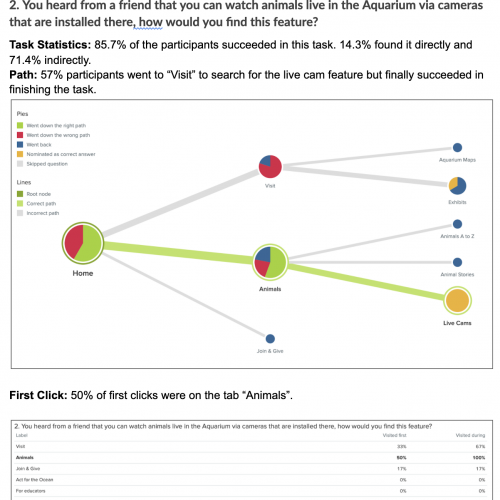
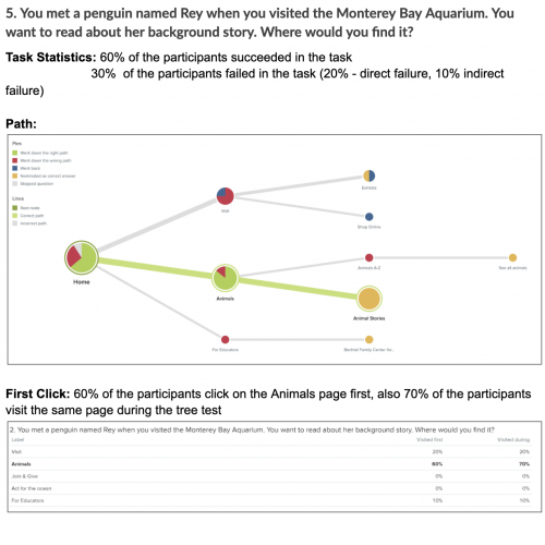
- People may deviate to “Visit” to look for live camera features, probably because “visit” is more a “Call to action” compared with “Animals”.
- “Live Cams” are relatively hidden in the Animal section and only a minority of participants find the page directly.
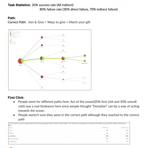
- People go to “Act for the ocean” to take any action for donation. Since people thought “Donation” can be a way of acting towards the ocean.
- “Match your gift” fails to make people aware of what it actually means.
Design Recommendations
- To differentiate “Live Cams” from other content in the Animals section by prioritizing in a hierarchy with visual adjustments.
- Put carousel for Live cams on the home page to enhance its discoverability and hence increase user engagement.
- Change the “Match your gift” to “Match your donation”.
Prototyping our hypothesis with clients and get ready to test
Never enough but good to move forward
Prototype with our assumptions and hypothesis
- Assumptions: 1. Live cam pages attract traffic. 2. People like to jump between live cams. 3. More exposure drives more donations.
- Hypothesis: 1. Carousel design on live cam pages would better engage the digital visitors and thus increase their loyalty. 2. People are likely to reach deeper content through live cam pages. 3. People would more likely to donate with an easier and streamlined experience.
Prototype with the hypothesis
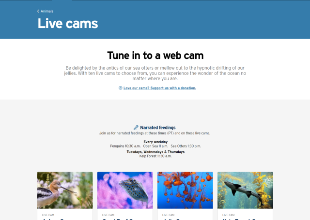
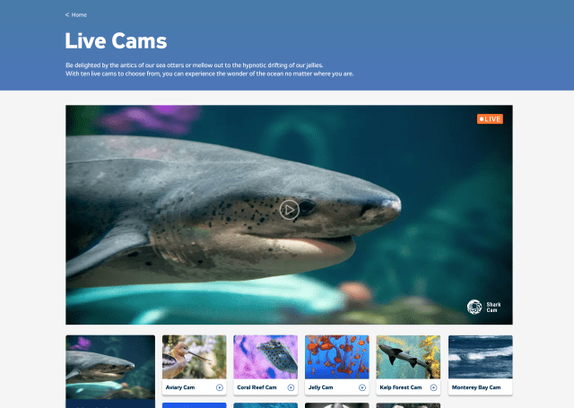
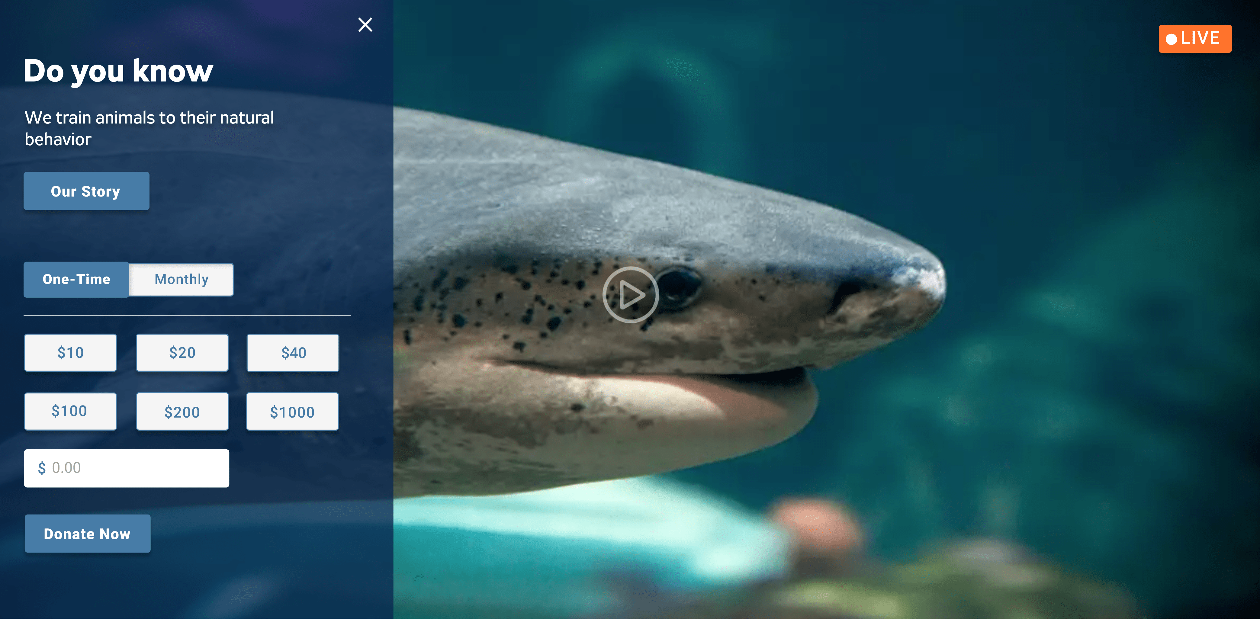
Showing user streaming directly, introducing a navigation panel, and providing users deeper content on the same page.
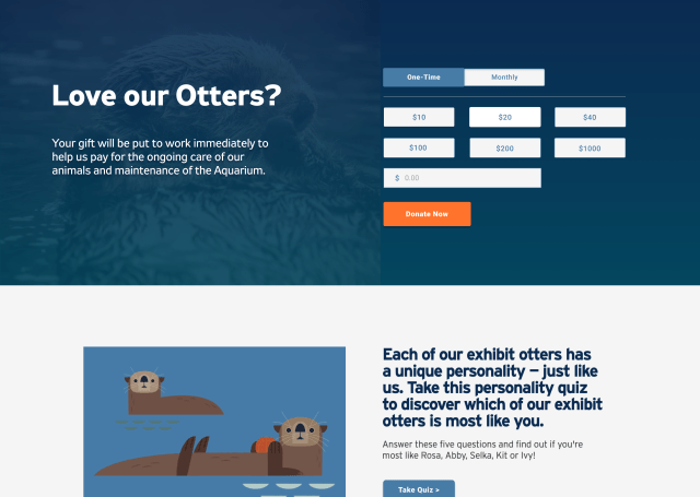
We tell stories to build emotional connections because people donate for things they can feel.
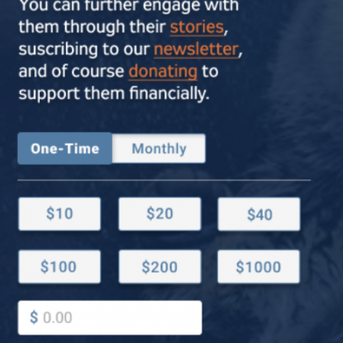
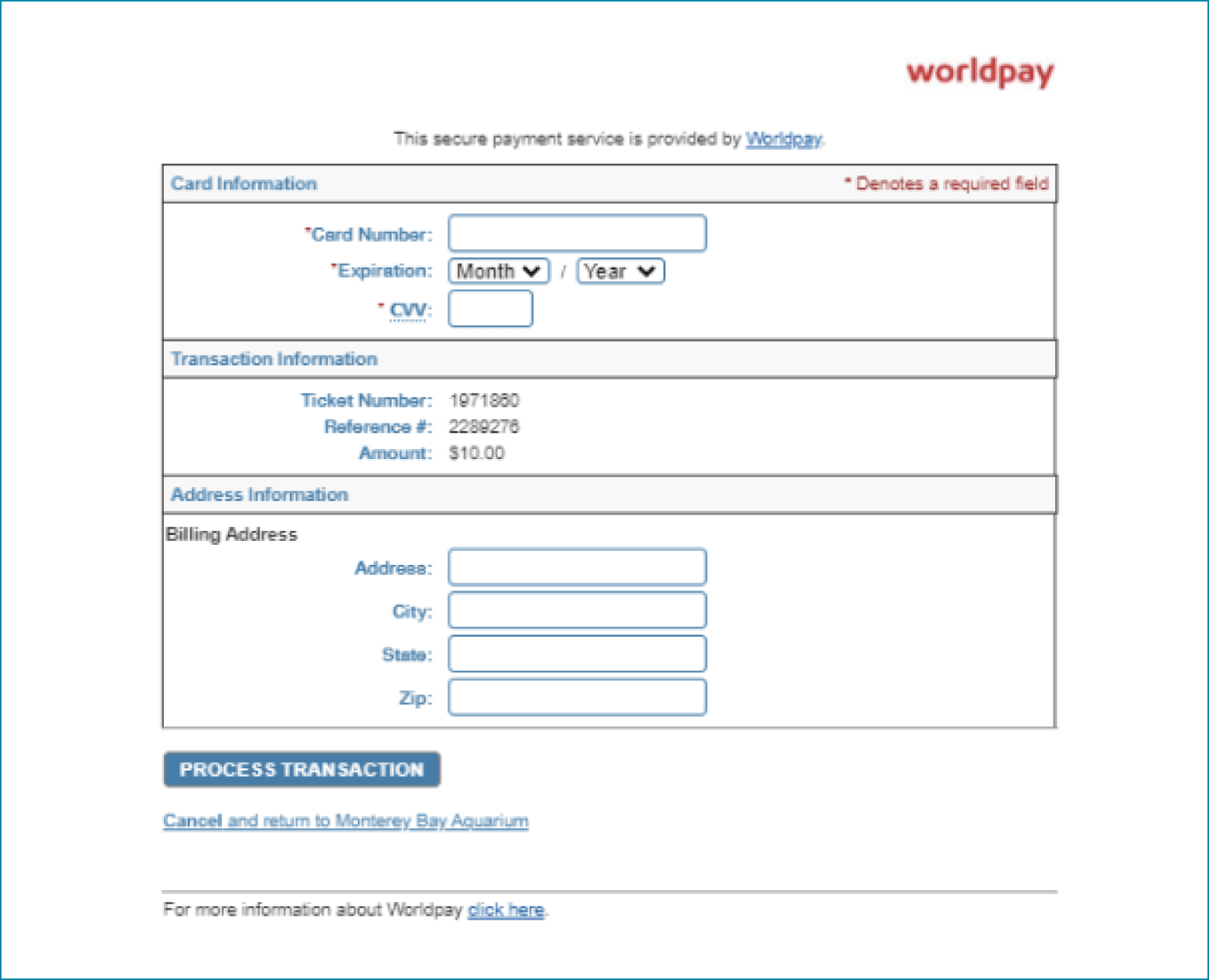
We increase the donation rate by applying story-driven strategies and simplifying the donation process.
How well does our target user groups interact with our hypothesis? Does them meet our objectives?
- Make deeper content more discoverable through effective navigation.
- Improve ease of use and maximize user engagement with the content on Live Cam Pages.
- Increase support opportunities from users through improving engagement with Animal Pages.
Due to the limited budget and timeline, we want to shorten the recruitment process with enough insights
Moderated Usability testing + Survey
- We want to gather more qualitative insights about the original website while testing out how the new version works.
- We were planning to run user testing to understand how people interact with the current MBA site and the prototype to: 1) verify the pain points we identified in the previous research session, 2) evaluate how the prototype works for the participants.
- We let participants process the similar tasks on the MBA site and the Figma prototype while recording how they interact with the video platform.
Screening Participants
We want two participants groups as fit for digital visitors and donors. We also want to ensure they are website users.
Bias Control
We let a group of participants conduct the the original version first and another group the designed version first. We also keep both version on Figma so that participants would have a consistent experience.
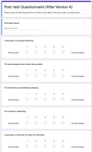
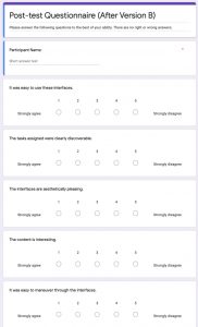
Post-test Survey
We let participants rate each task after the testing for each version so that we could have another scale for comparison.
Problem Synthesis
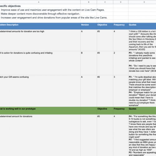
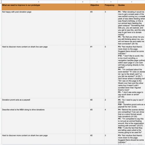
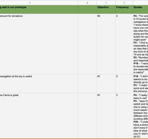
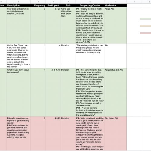
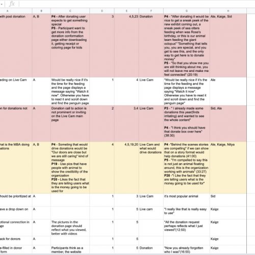
We created a problem list to synthesize the common problems and prioritize according to the objectives.
How users perform each task on the two versions and records
SAMPLE PROBLEM LIST & INSIGHT LIST
To compare the performance of the two versions in another way
What were problems with the design?
Donors want to be treated special
“So that you show me you are still thinking about me, you will not leave me and make me feel connected.” - Participant (Donor)
Pay-for-View Service
“Behind the scenes stories are compelling, if we can show that on a story format would help donations.” “I like the fact that they are telling users what is the money going to be used for.” - Participant (Donor)
Hidden deeper content
Participants did not notice they can scroll down to access deeper content, because there is no indicator in the streaming page. (Observation)
How does the original version works?
Cute animal drives traffic
Digital visitors like to click into the pages with cute animals, which enlightens us to think about using the attracting images like sea otters on the front page. (Observation)
Default donation amount is intimating
We let participants rate each task after the testing for each version so that we could have another scale for comparison. (Participants & Literature review)
We iterated the prototype accordingly
We tell stories to build emotional connections because people donate for things they can feel.
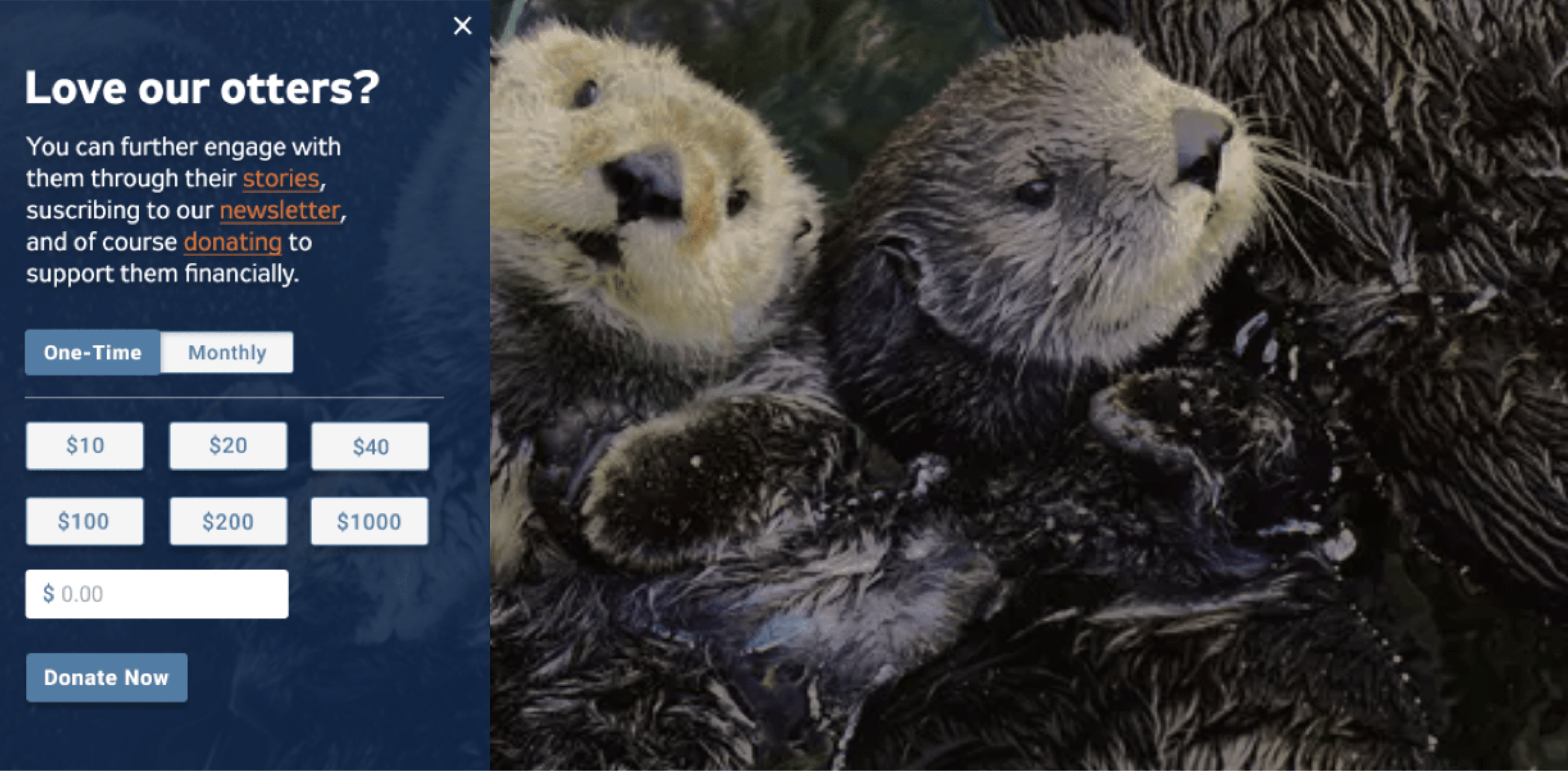
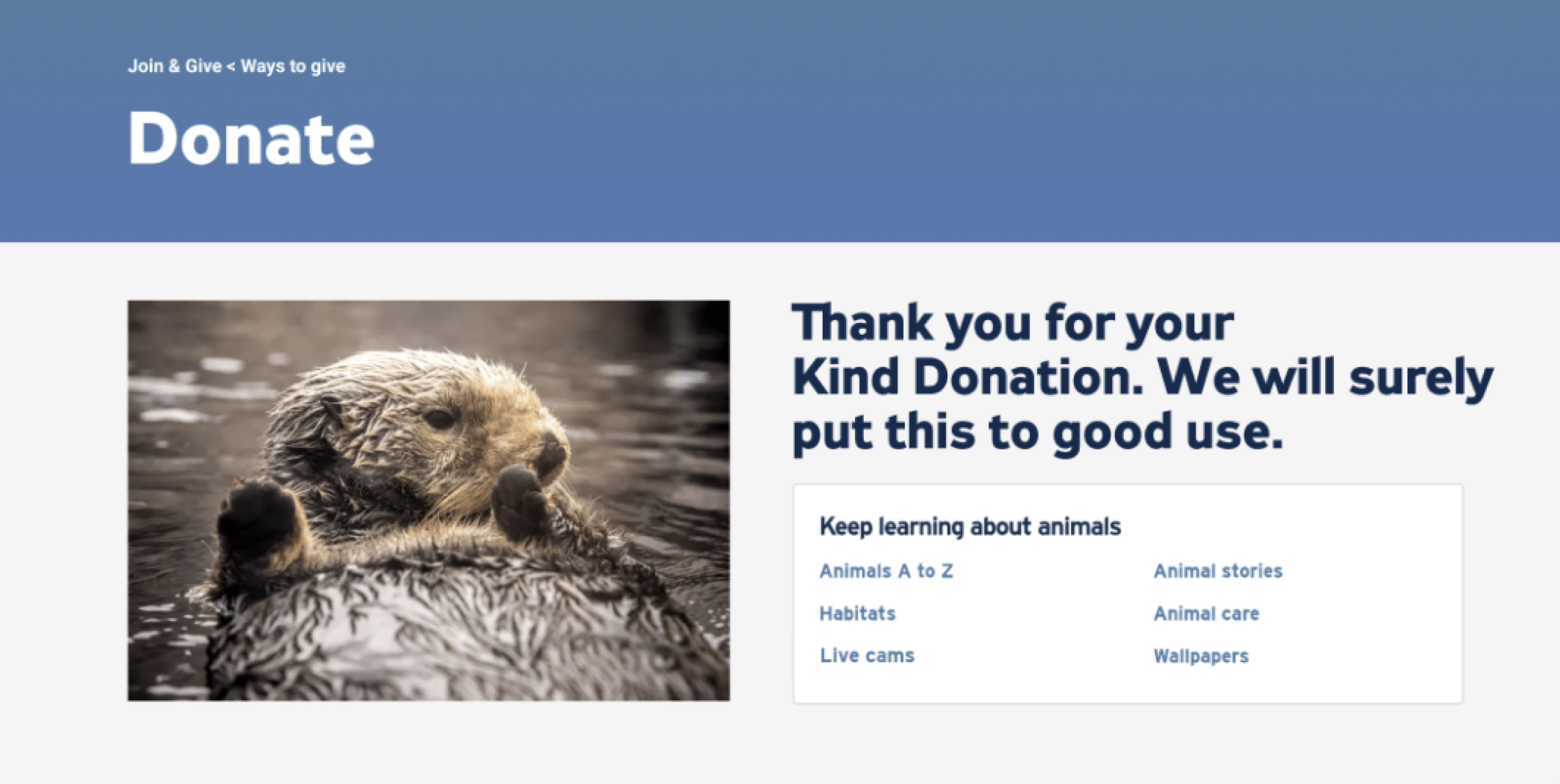
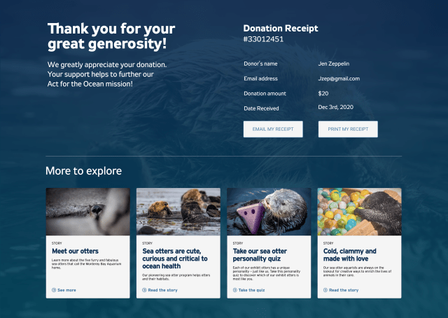
We want donors feel special after donating when they can see the customized downloadable content in the thank you page.
The stakeholders love the work and adopted the recommendations.


